 |
Register or Log In To remove these advertisements. |
|
|
|
|||||||
 |
|
|
Thread Tools | Display Modes |
|
|
#1 |
|
Senior Enthusiast
Join Date: Feb 2007
Location: Spokane Valley, WA
Posts: 8,356
|
The importance of color
Ive read where model collectors (especially of die cast cars) end up with an entire cabinet full of vibrant red cars. Each car looks great but the unique interest becomes lost in a sea of red. I have a similar creative deficiency except my favorite color for both model cars and real cars has always been black. I generally build models to look like a real car I would actually like to own. This has resulted in a collection of predominantly black cars and trucks. Taken individually each may look spectacular, but viewed as a group it gets pretty boring.
Years ago I sprayed most of my models with hardened automotive acrylic enamel, but since I have a beard and no breathing gear I gave up using hardener years ago. Then I discovered Tamiya spray lacquers and have been using them exclusively for several years. Compared to Testors enamel which dries so slow it can fingerprint months later, the lacquer can be sprayed one day and assembly begin the next with no fear of damage to the finish. The problem with Tamiya being their color selection is rather limited. Then my son let me know about the new Testors lacquer paints. They dry just as fast as the Tamiya lacquers, but offer a variety of brilliant and interesting colors. The only Tamiya color I continue to use is black, because it is much blacker than the Testors version. So a while back I started experimenting with adding some bright/wild colors to the collection, just for visual interest. The first was this 40 Ford replica from the movie The Blob. Its painted an old Testors metallic red which looks more like candy apple. 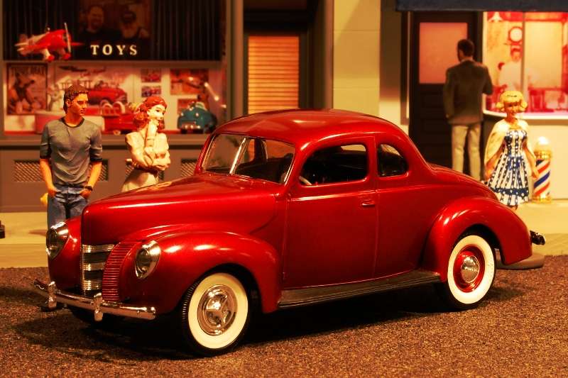 The next project was this Fiat racer I got from my son. It was a bland green so I repainted it Testors gold enamel. Mixed in with the black collection it really popped. 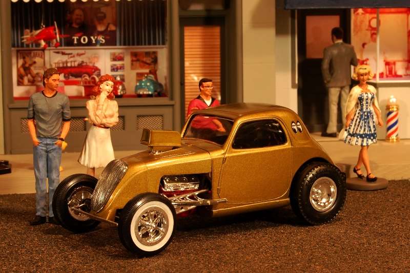 Next up was an old MPC snap together Mercury from the mid 70s. It was snapped together when new and left unloved because it was basically ugly. When new it was a dull red with brown interior and plastic tires. Over the years it grew even duller like reddish brown primer. 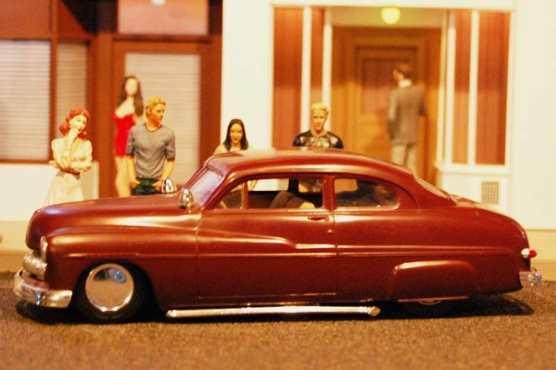 It was popped apart and sprayed with Testors Purple-Licious Lacquer, while the interior was shot in white. The 49 Ford in the background is an old Testors turquoise enamel: 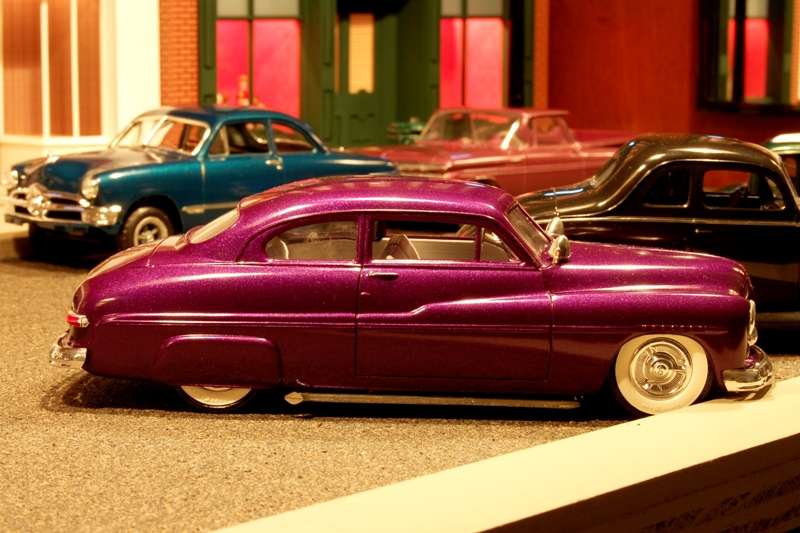 Expanding into something that should wear outlandish paint that I would never own in real life, I picked up a 59 El Camino kit and sprayed it with Testors Mythical Maroon, which turned out more of a dusty rose color. It has no bare foil detailing yet but is put together enough to look like a car: 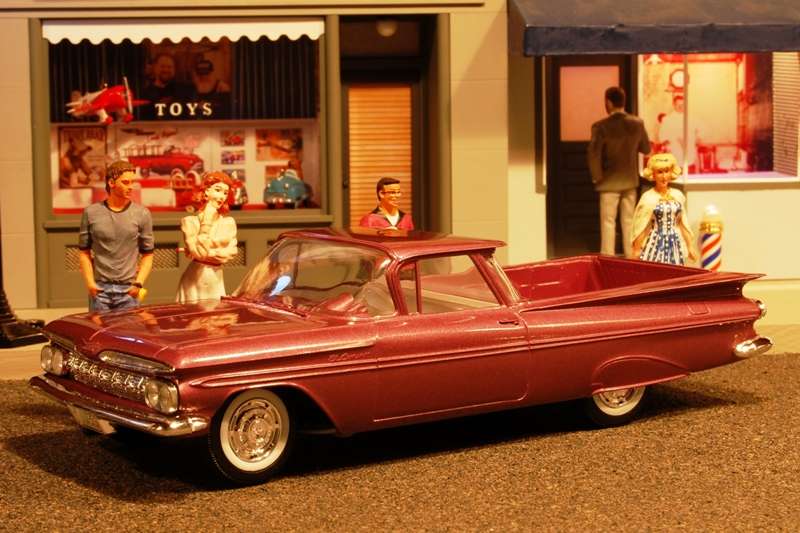 This turned out so nice I decided to build something really goofy so I bought one of the old crappy Lindberg kits with the plastic tires. After a few minor improvements and a coat of Testors Transparent Blue enamel over a silver base, it ended up looking reasonably cool: 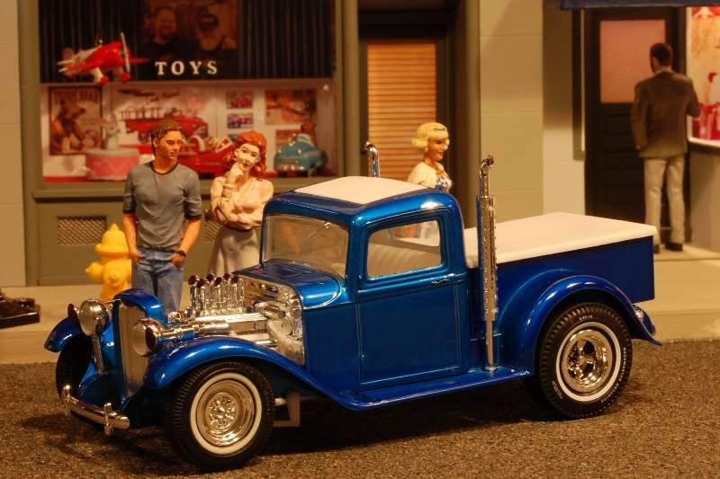 Next up was a 1960-61 vintage chopped 36 Ford coupe I bought years ago. Most of these original black kits can be polished to an extreme luster with a little elbow grease. This one turned into a swirly marbleized color that looked terrible. It was disassembled and sat in a box for over 10 years while I debated what to do with it. Since my discovery of the Testors lacquers, it was also pulled out and shot in DeJa Blue: 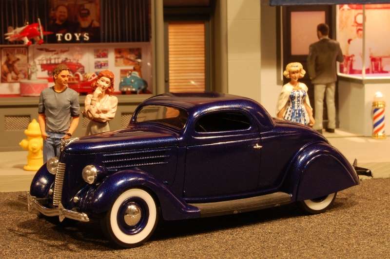 And the latest build was a 1940 sedan delivery I never intended to build. It was purchased years ago specifically for the single bar flipper wheel discs and DeSoto bumpers. The rest was tossed in the parts box. Wanting a shop truck for the speed shop, it seemed appropriate to paint something really bright. I dug up enough parts to complete the build and shot it with Testors Flaming Orange: It was an interesting paint job. For the first time since I started spray painting back around 1958, the can of paint I bought did not come with a spray nozzle. And it remained factory sealed. I didnt think too much about it, just grabbed another matching nozzle and got to work. After fully painting the body and hood, I started on the fenders when the can spewed like old faithful! Every time the nozzle was depressed, paint shot straight up around the stem about 4 inches! I tried 2 other nozzles with the same result. Figuring Id never be able to match the paint, I decided to shoot the fenders in bright blue and build it like an old Westinghouse truck (orange and blue). So the fenders were given a beautiful finish in DeJa blue. Put together, it looked stupid. I picked up another can of flaming orange having a very low expectation of success. I taped everything together and gave it three more coats of orange, painted directly under a pair of heat lamps. Amazingly it came out with one of the glossiest finishes Ive ever done. In spite of how much paint is on the model, the belt line detail remains pretty crisp. 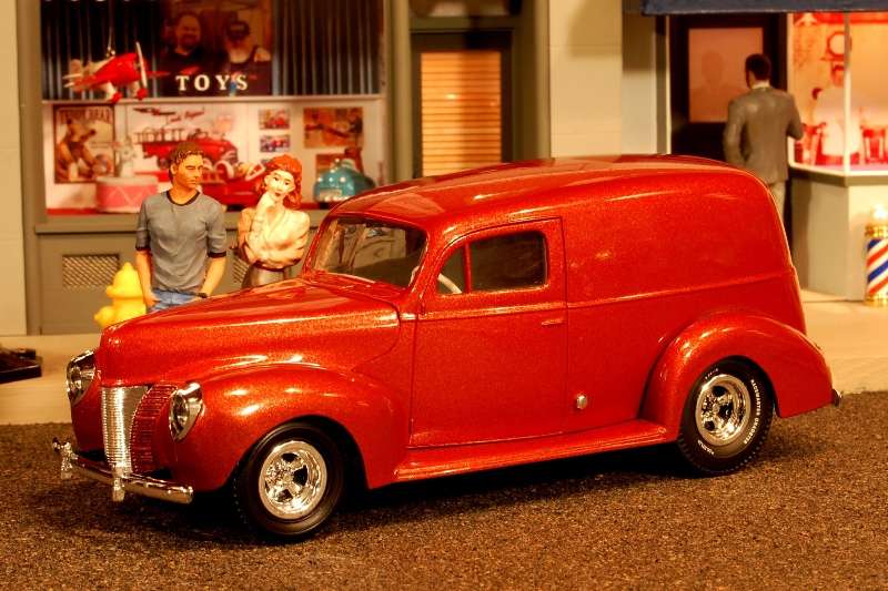 And finally here is an overview of assorted black vehicles from the collection followed by a comparison photo with more colorful creations. The brighter colors certainly generate a lot more interest from visitors: 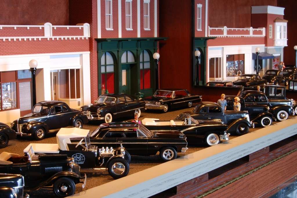 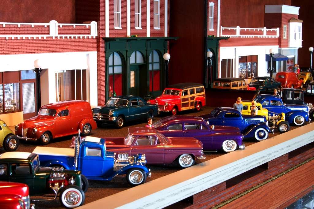
|
|
|

|
|
|
#2 |
|
Registered User
Join Date: Feb 2000
Location: Wichita Falls, Texas
Posts: 3,153
|
Re: The importance of color
Definitely much better with all the colors. I understand your thing for black, though, and building your models the way you'd want them in real life. If it were me, there would be a sea of blue cars.
You know, that couple on the curb doesn't change their expression for any of the cars they're looking at. Shallow folks...  Is that blonde in the blue and white dress supposed to be Debbie from American Graffiti? |
|
|

|
|
|
#3 |
|
Senior Enthusiast
Join Date: Feb 2007
Location: Spokane Valley, WA
Posts: 8,356
|
Re: The importance of color
Yes that is a Debbie figure and the one behind the Fiat and El Camino is the Toad figure. They were issued with some of the American Graffiti cars about 10 years ago. They were also packaged with 1/64 hot wheel Graffiti cars as well. They are relatively hard to find now, and most are outside my budget. They look better in real life than in the photos.
|
|
|

|
|
|
#4 |
|
Registered User
Join Date: Aug 2011
Location: Modesto, Claifornia
Posts: 236
|
Re: The importance of color
Really cool collection, thanks for sharing.
and I'm gonna have to give those colors a look see. I'm stuck in a flat and satin stage, I'm workin on a 64 fleetside and plan on using a dark flat grey with a little fauxtina 
__________________
Blessings, Ryan G JESUS IS LORD!!!!!! 
|
|
|

|
|
|
#5 |
|
Special Order
  Join Date: Nov 2004
Location: Mt Airy, MD
Posts: 85,851
|
Re: The importance of color
Colors like red or black are sure-fire winners. But,I'm more of a "show people how a good a least expected color can look" kind of guy. That,or I pick a color by what vehicle it goes on and what era and'or style I'm after. Like that Topolino in gold with the wide whitewall slicks. That screams late '50s-early '60s. Or,that Transparent Blue Ford pickup with white naugahyde,chrome reverse,etc. The '40 panel has a late-60s look with what you did. There's always a place for black and red blended in,too. That Lindy Black Widow kit just had to be black
__________________
"BUILDING A BETTER WAY TO SERVE THE USA"......67/72......"The New Breed" GMC '67 C1500 Wideside Super Custom SWB: 327/M22/3.42 posi.........."The '67" (project) GMC '72 K2500 Wideside Sierra Custom Camper: 350/TH350/4.10 Power-Lok..."The '72" (rolling) Tim "Don't call me a redneck. I'm a rough cut country gentleman" R.I.P. ~ East Side Low Life ~ El Jay ~ 72BLUZ ~ Fasteddie69 ~ Ron586 ~ 67ChevyRedneck ~ Grumpy Old Man ~ |
|
|

|
|
|
#6 |
|
Senior Enthusiast
Join Date: Feb 2007
Location: Spokane Valley, WA
Posts: 8,356
|
Re: The importance of color
Only marginally related to 60-66 trucks (there is a 61 in the last photos), heres another update on the Universal Studios diorama in the background of the photos above.
After sitting idle for the last 2 ½ years because I couldnt dream up what types of businesses to put in the other shops, I finally found inspiration somewhere and got things moving again. The toy store got a building sign, the second shop became a camera store, the speed shop got signs in the upper window panels, and the fourth shop became a drug store complete with upper panel and hanging signs. The advertising displays in the windows are photo reductions of real advertisements specific to each building. The speed shop will soon get a name on the door or windows. I still havent done anything with the large building on the far right. I also need to add glass to the camera and Rexall shops, which will happen after I build a couple of cameras for window display and some junk for the drug store. I think it's finally becoming realistic enough to hold interest looking at the various details. Here are some additional photos. The first is an overview showing the lack of exterior signs: 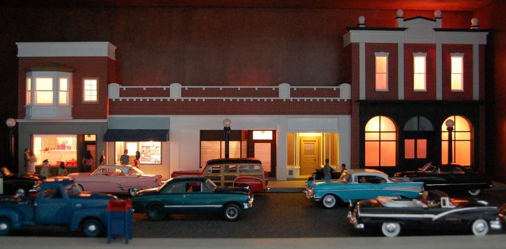 The next two are how the set looks today: 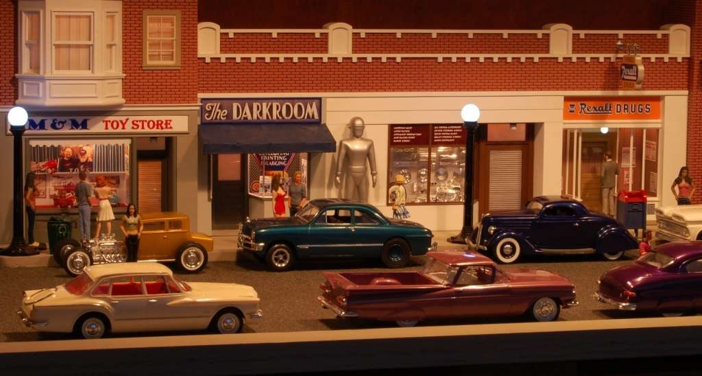 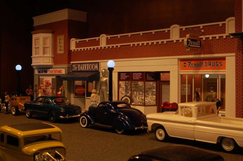
|
|
|

|
|
|
#7 |
|
Registered User
Join Date: Oct 2000
Location: Abilene Texas
Posts: 1,756
|
Re: The importance of color
Cool dioramas.
This reminds me of the movie 'Pleasantville"
__________________
Robert Member 1532 Last edited by 90\87Formula; 12-14-2011 at 08:18 PM. |
|
|

|
|
|
#8 |
|
Registered User
 Join Date: Jul 2010
Location: Ontario CA
Posts: 317
|
Re: The importance of color
really nice diorama....the colors wake it up nicely. There IS a reason you don't see many magazine cover cars in black!
Dig the orange sedan delivery. The Topolino is screaming out for some lettering on the sides! Thanks for sharing Tim
__________________
Ontario CA70 Chevy Shortbed Fleetside C-10 71 Chevy Longbed Fleetside C-20 (sold  ) )63 Chevy II Nova SS 02 Ford F-150 Harley-Davidson supercharged 5.4 2000 Harley Roadking Hot Bike Baggers Mag Shoot http://s263.photobucket.com/albums/i...oot/?start=all some truck lettering & flame jobs http://www.flickr.com/photos/4950319...7602894916215/ |
|
|

|
|
|
#9 | ||
|
Senior Enthusiast
Join Date: Feb 2007
Location: Spokane Valley, WA
Posts: 8,356
|
Re: The importance of color
Quote:
Quote:
1949-54 Ma & Pa Kettle 1953 It came from Outer Space 1955 Tarantula 1957 Monolith Monsters 1957-63 Leave it to Beaver 1958 Earth versus the Spider 1958-61 Peter Gunn 1959 Twilight Zone pilot 1965 Village of the Giants 1977 The Car 1984 Gremlins 1985 Back to the Future Last edited by markeb01; 01-07-2012 at 02:55 PM. |
||
|
|

|
|
|
#10 |
|
Special Order
  Join Date: Nov 2004
Location: Mt Airy, MD
Posts: 85,851
|
Re: The importance of color
If you made the lettering for the Topo,how about "Fiast-o!"? Just a snap thought. Proly kinda dumb,though. Probably a team or shop name would be best.
__________________
"BUILDING A BETTER WAY TO SERVE THE USA"......67/72......"The New Breed" GMC '67 C1500 Wideside Super Custom SWB: 327/M22/3.42 posi.........."The '67" (project) GMC '72 K2500 Wideside Sierra Custom Camper: 350/TH350/4.10 Power-Lok..."The '72" (rolling) Tim "Don't call me a redneck. I'm a rough cut country gentleman" R.I.P. ~ East Side Low Life ~ El Jay ~ 72BLUZ ~ Fasteddie69 ~ Ron586 ~ 67ChevyRedneck ~ Grumpy Old Man ~ |
|
|

|
 |
| Bookmarks |
|
|